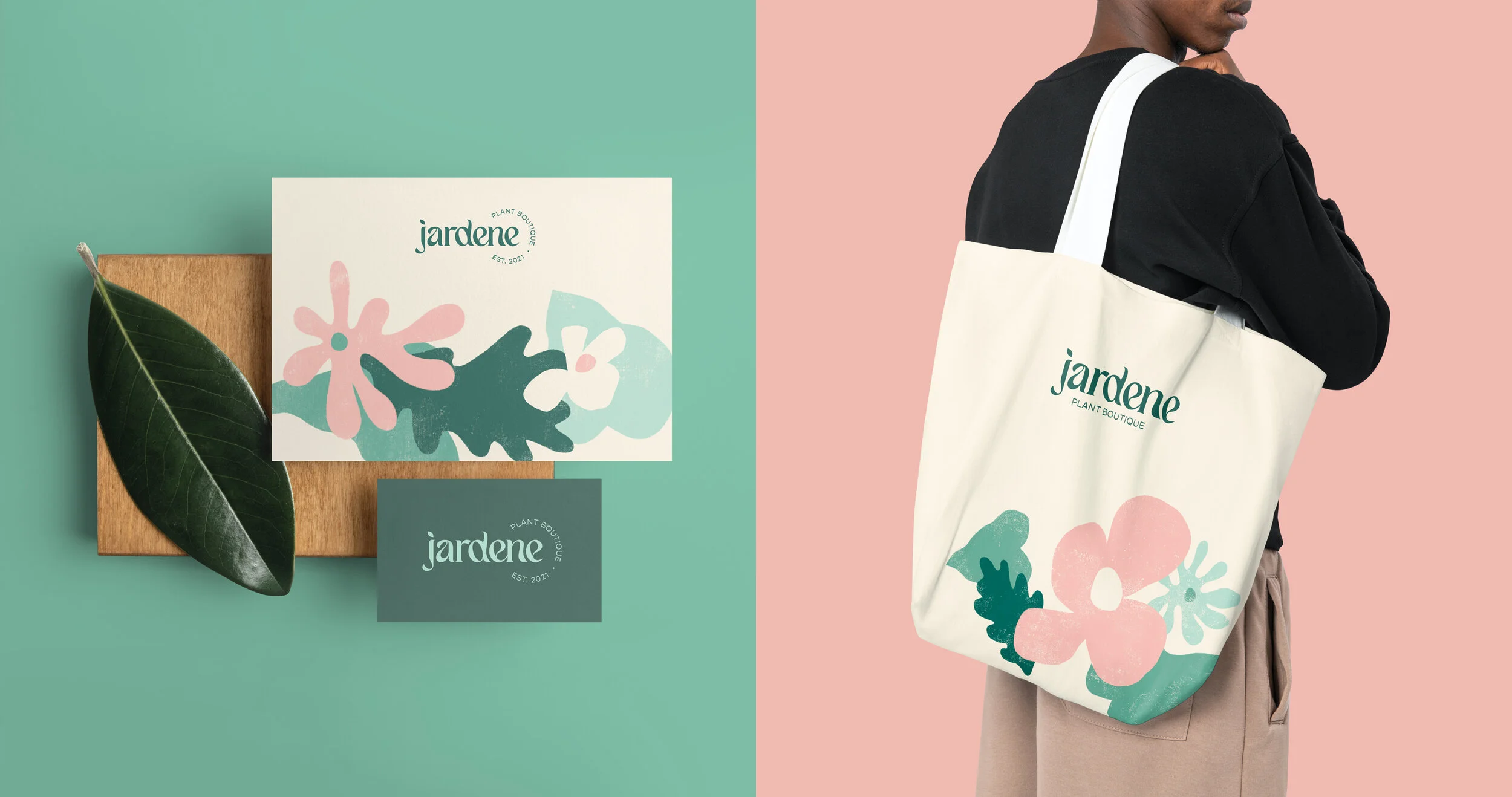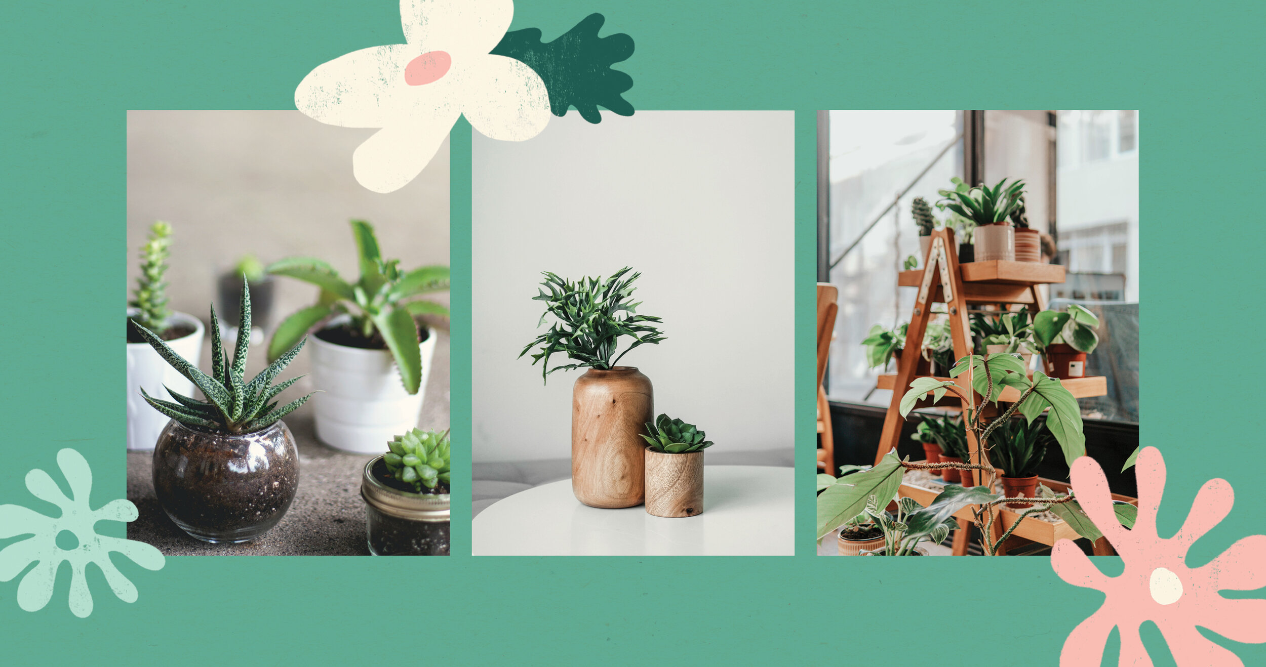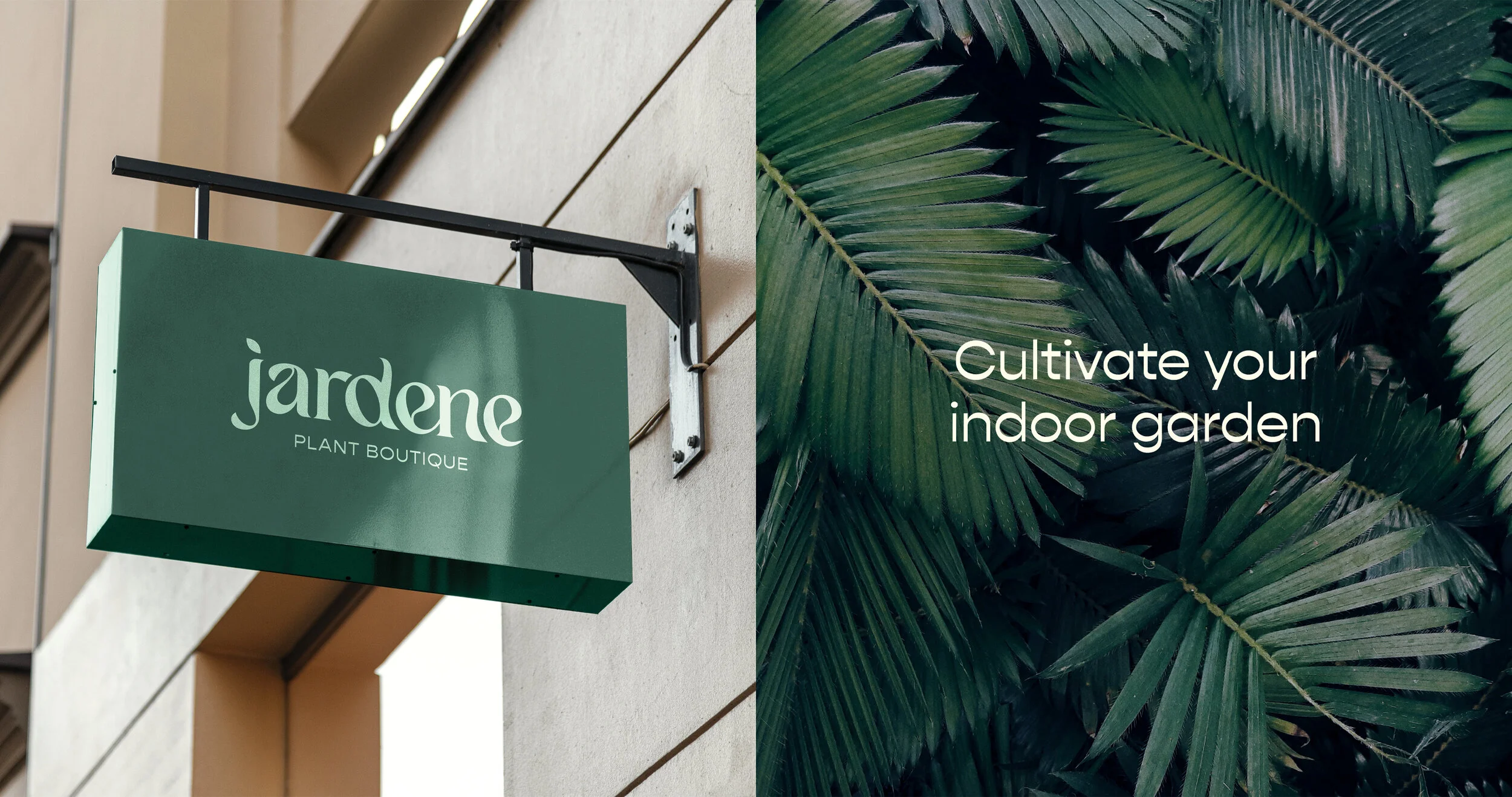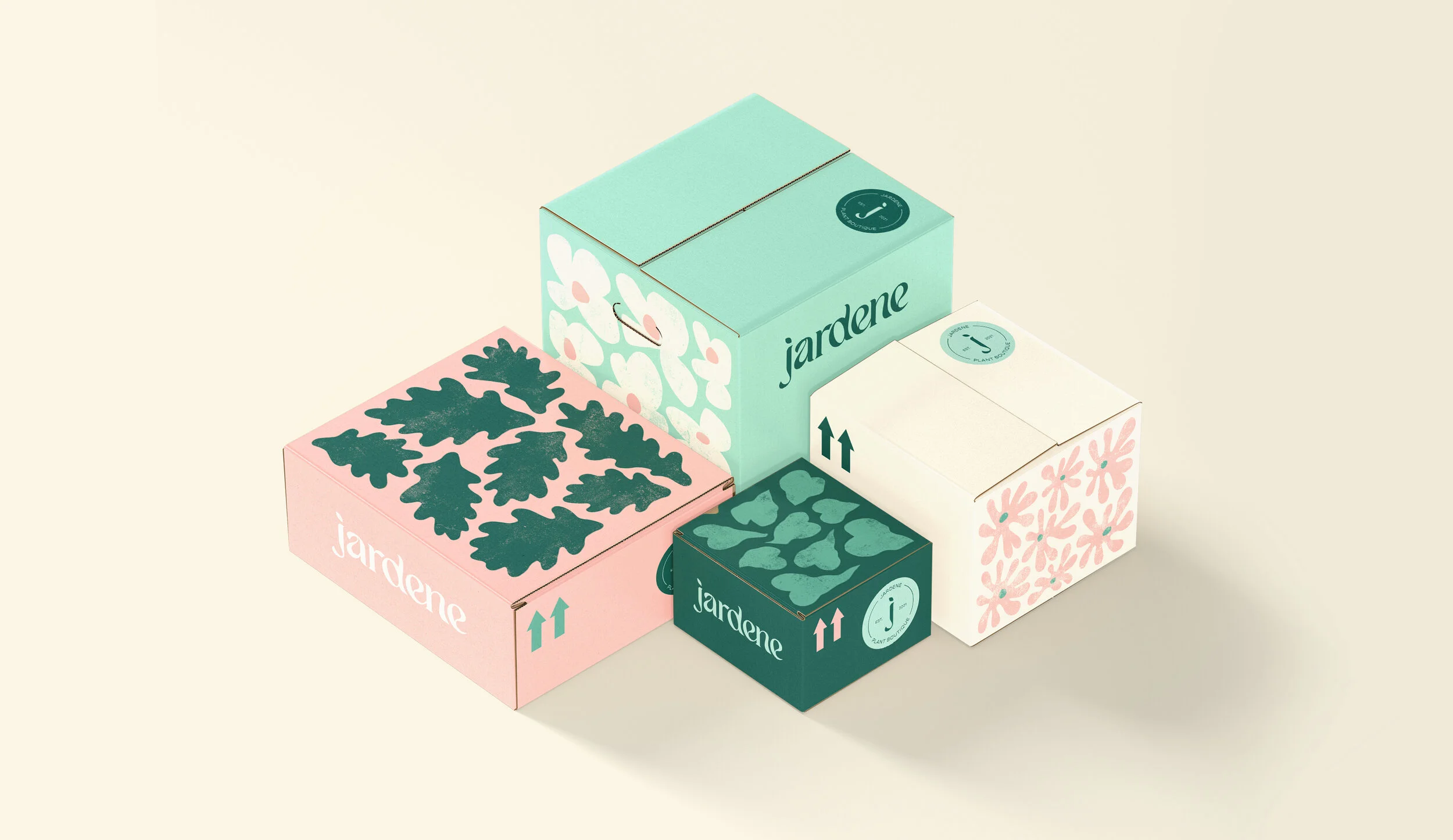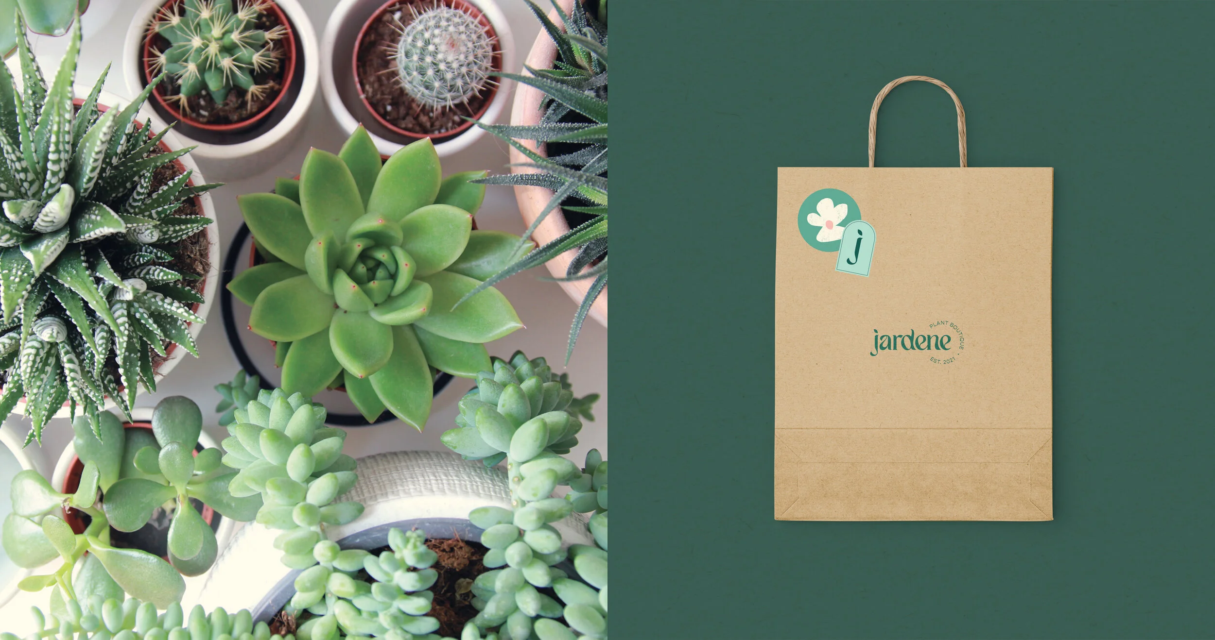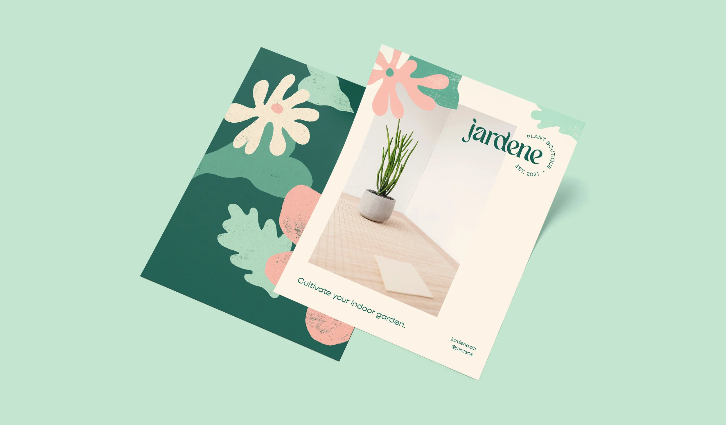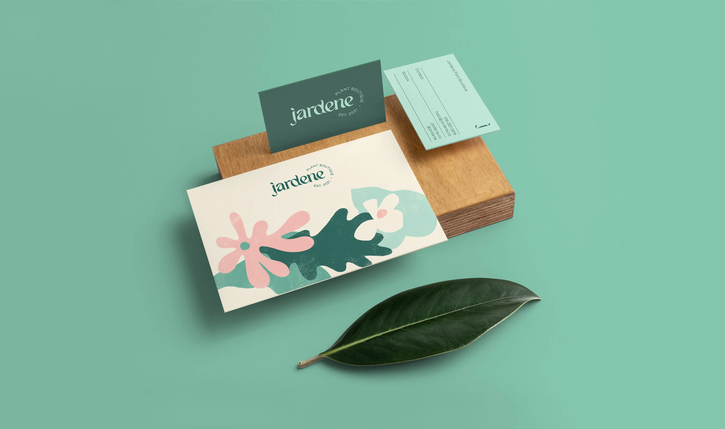
Jardene is a concept for a plant boutique which specializes in house plants of all kinds and additionally sells pots, terrariums, and various accessories. Its goal is to cultivate a sense of peace and creativity within customers by bringing a little bit of nature into each home. The delivery of this identity aims to convey the message that plants have a remarkable impact on people and the spaces we inhabit.
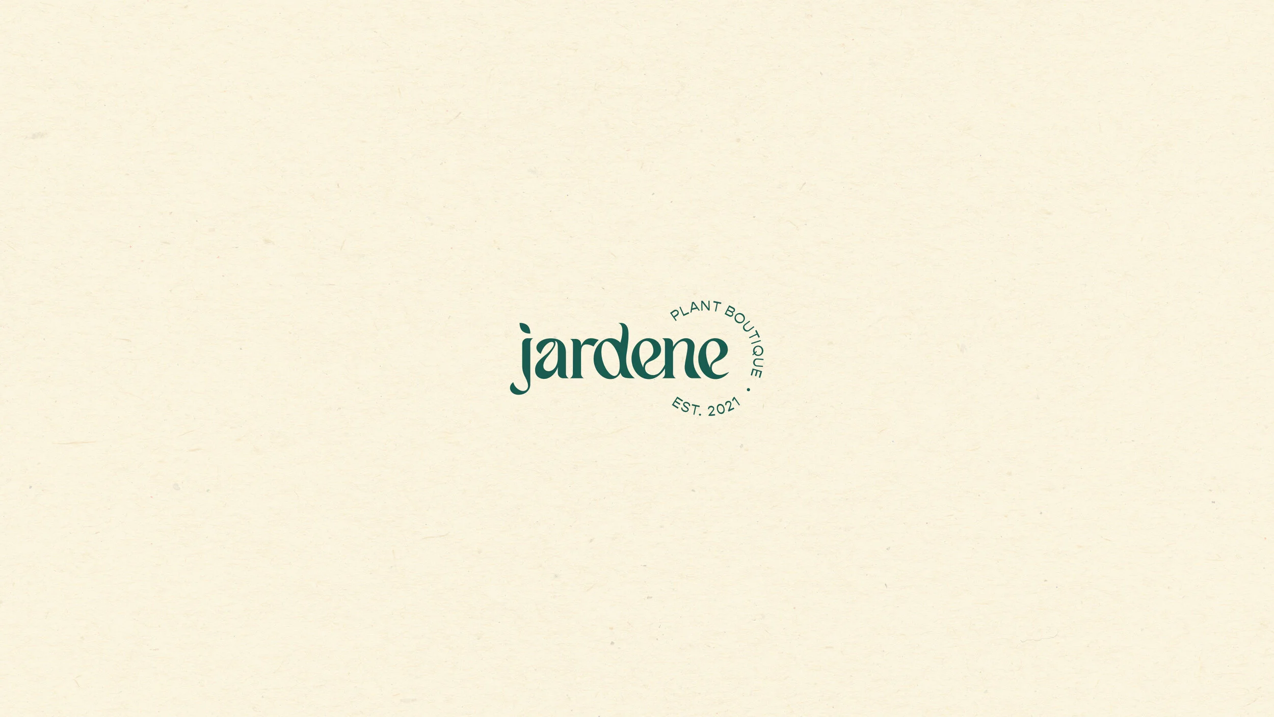
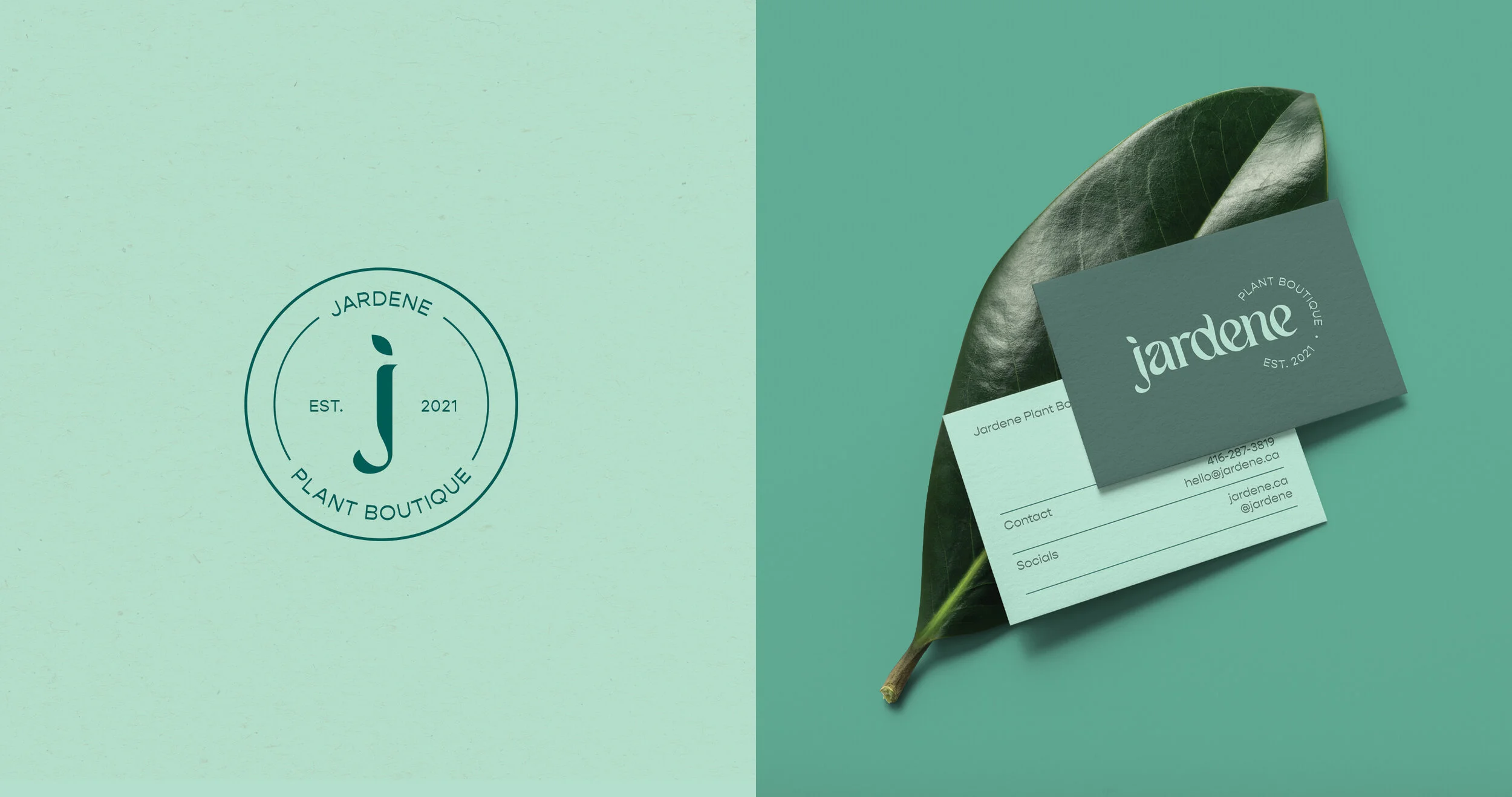
The typography of the logo was chosen for its elegant yet unique characteristics which convey the brand’s charm through stylized terminations of the letterforms. The typeface was further manipulated to allow for better synchronization between each letter, and to create an overall flow reminiscent of the natural growth of plant life. A simple leaf shape is incorporated into the J as a representation of the most basic symbol of nature, reinforcing the brand’s purpose.
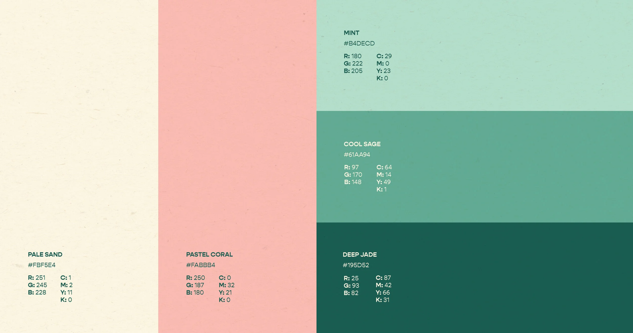
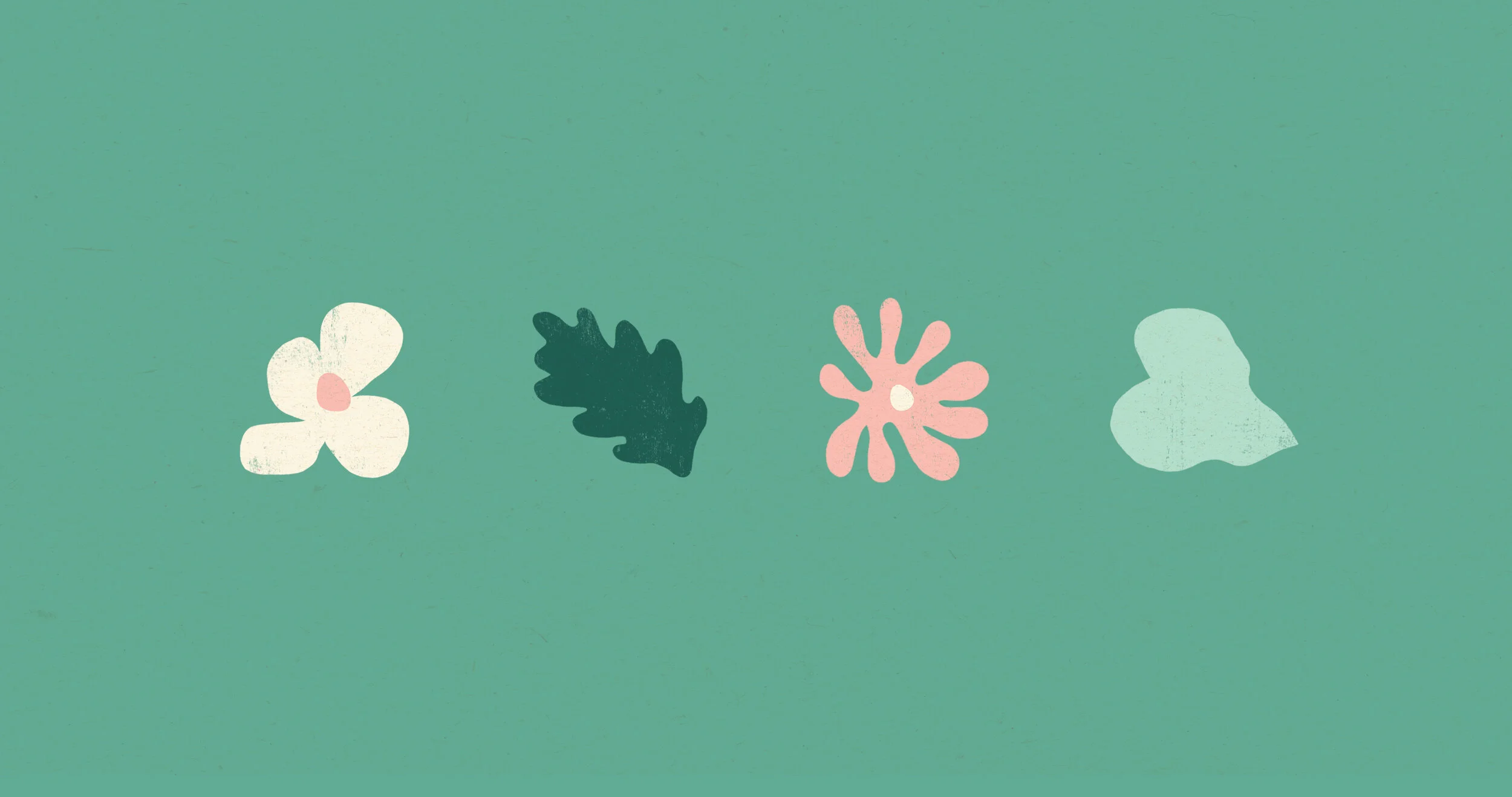
The graphic components of the brand identity are inspired by Matisse’s cut paper collage works which were revolutionary in the development of visual arts during the early 20th century. Jardene’s branding translates a few commonly found shapes in houseplants into simple graphic forms which represent the bond between nature and art. This visual system implements a combination of colours and visual elements which aim to spark creativity while invoking feelings of calm and serenity within the viewer.